Date
October, 2018
Info
1 Week
Individual
Idea
Creating a parametrized type.
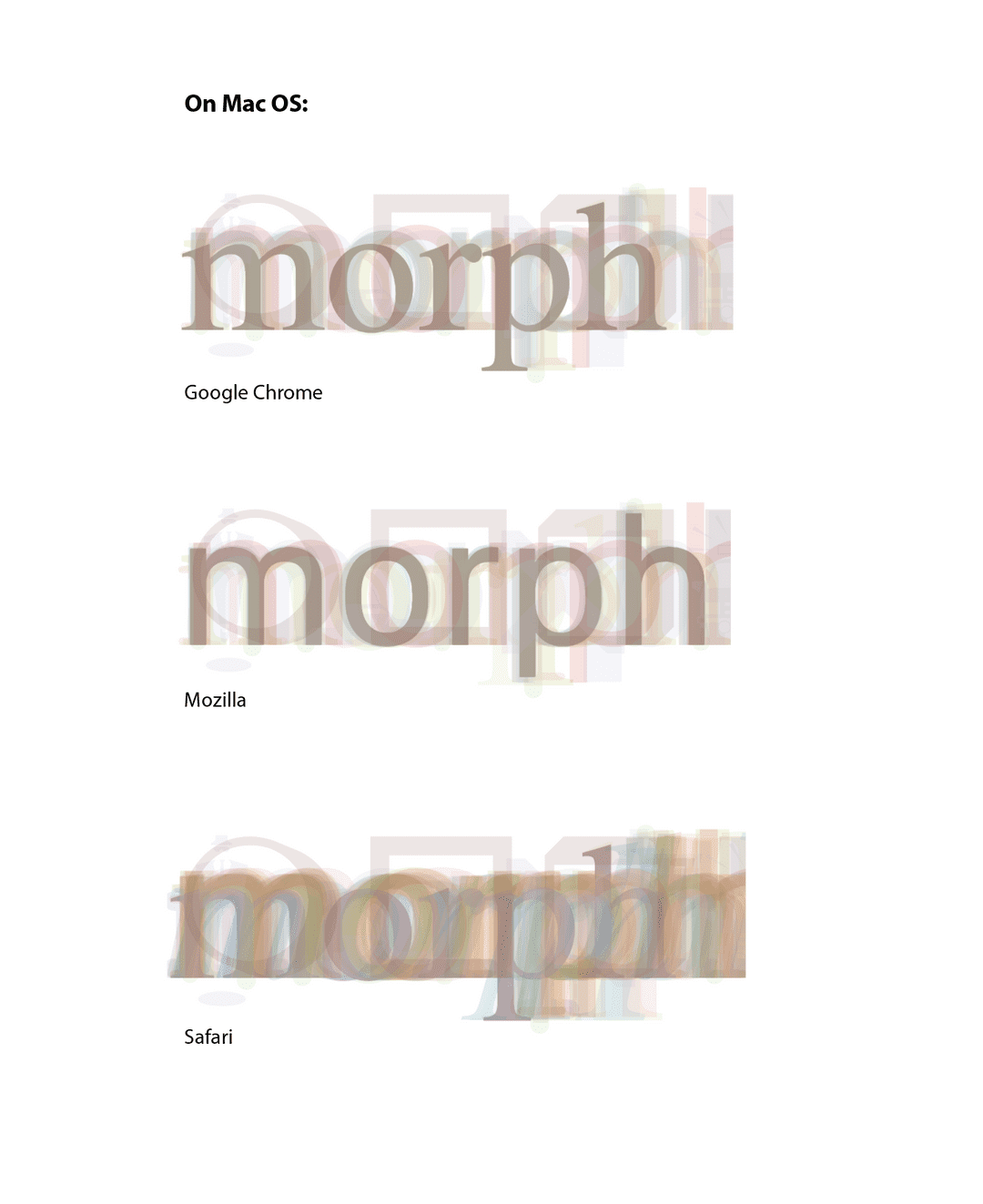
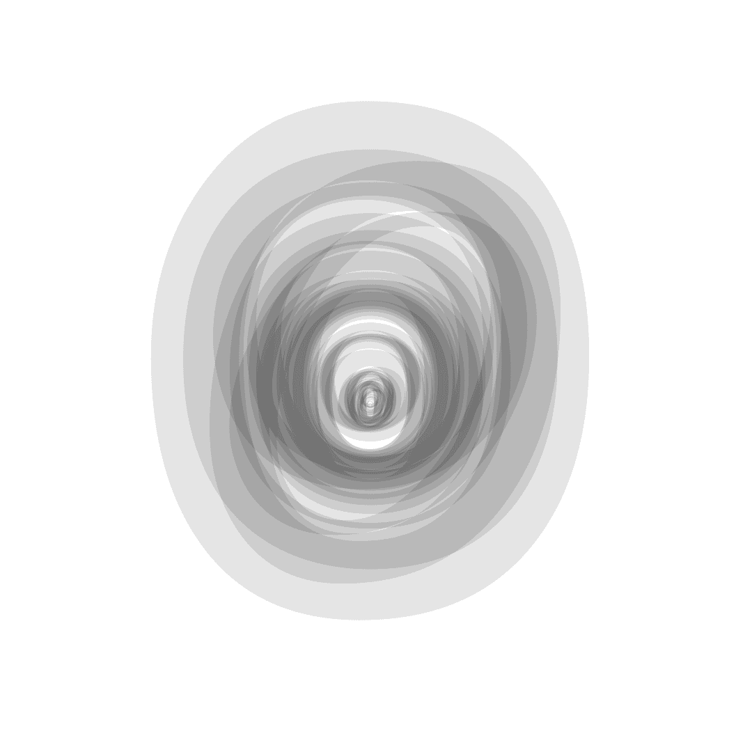
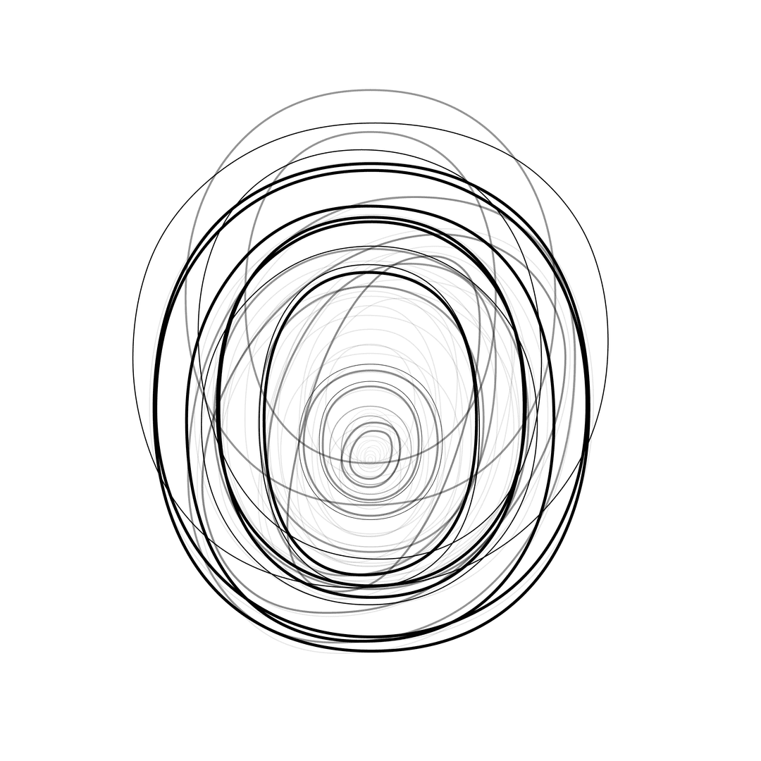
Thinking about typography, one of the central aspects to type is readability. I had the idea that if one averaged all of a system's fonts together, you would get the most readable form of each letter by what each font had in common.
Process
I created a D3 javascript function that overlaid each system font on top of each other.
Play around with it here: https://garrettvercoe.com/average-font/
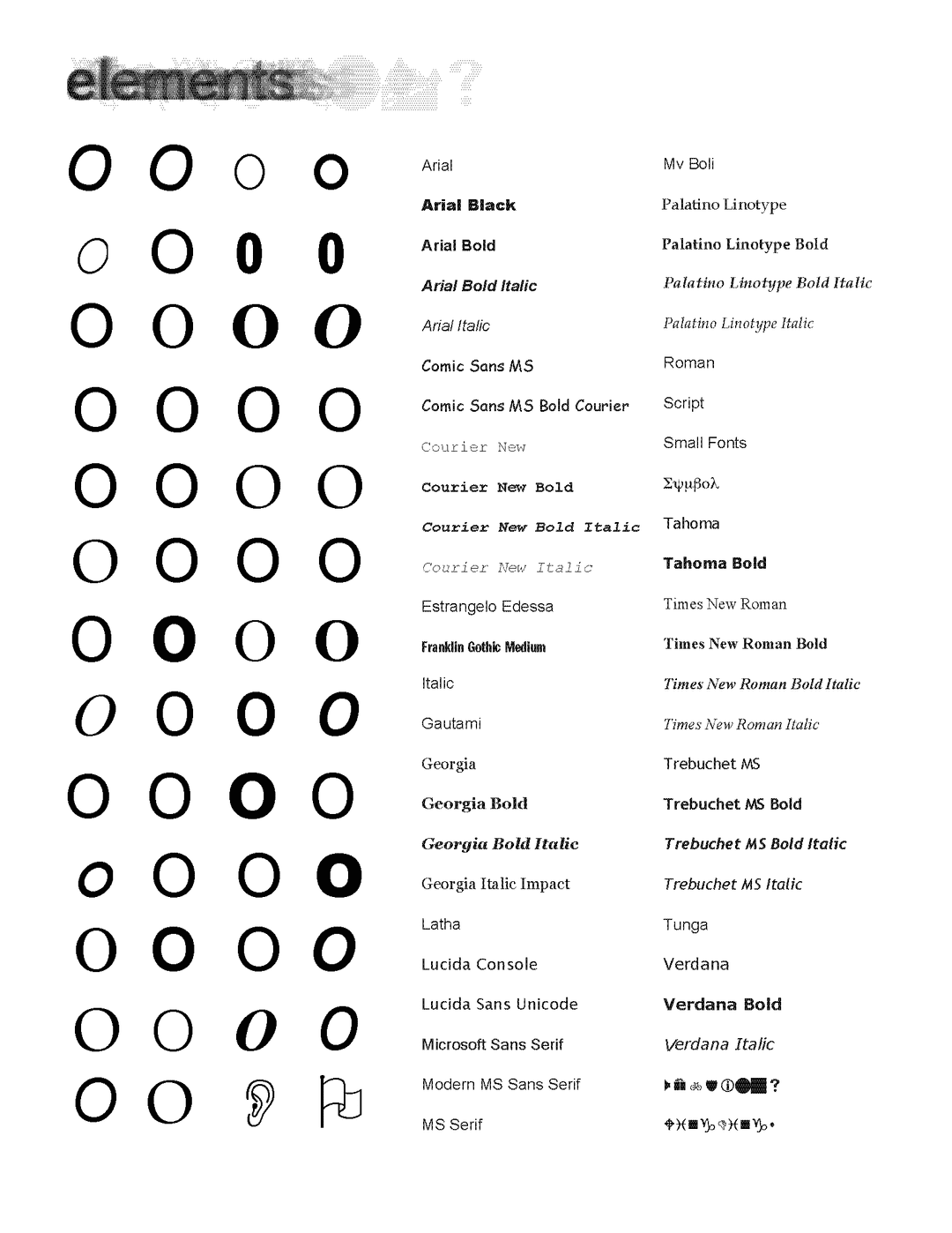
Each font is at a 5% opacity. You can see the fonts used below.
Some of the fonts are able to load in all browsers natively without import, so the font has a different appearance on each browser.
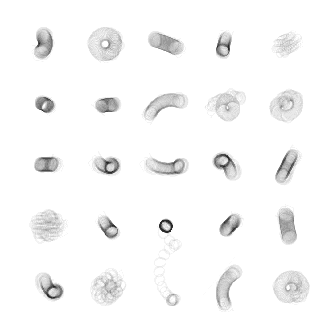
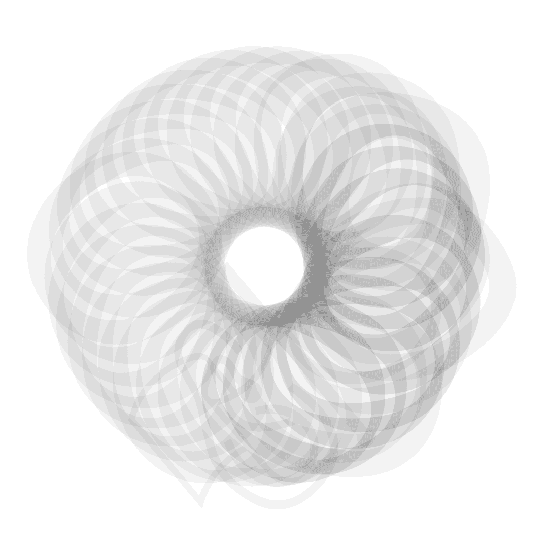
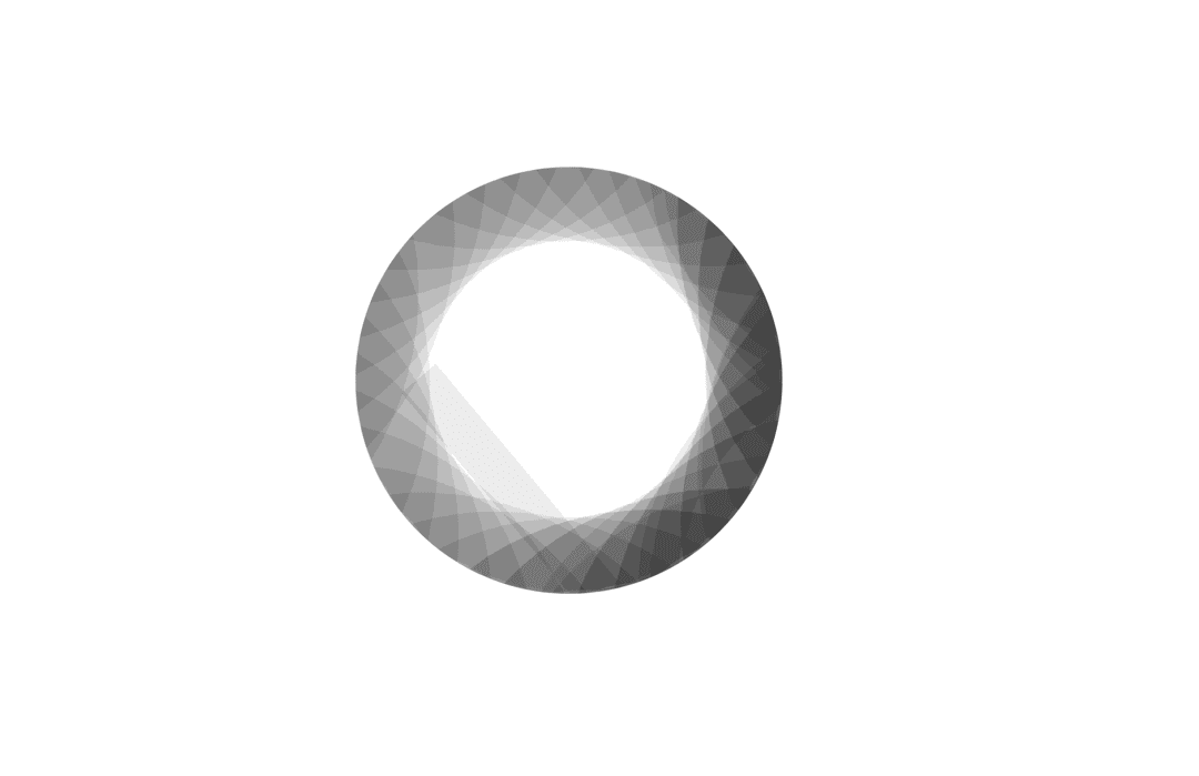
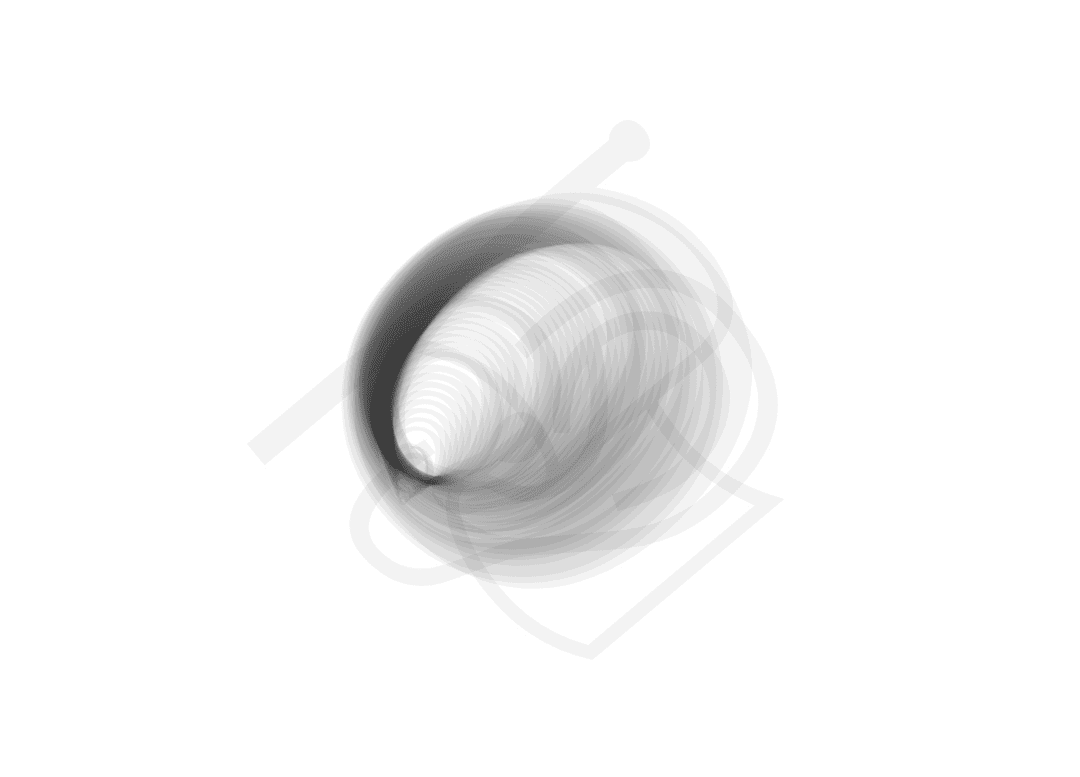
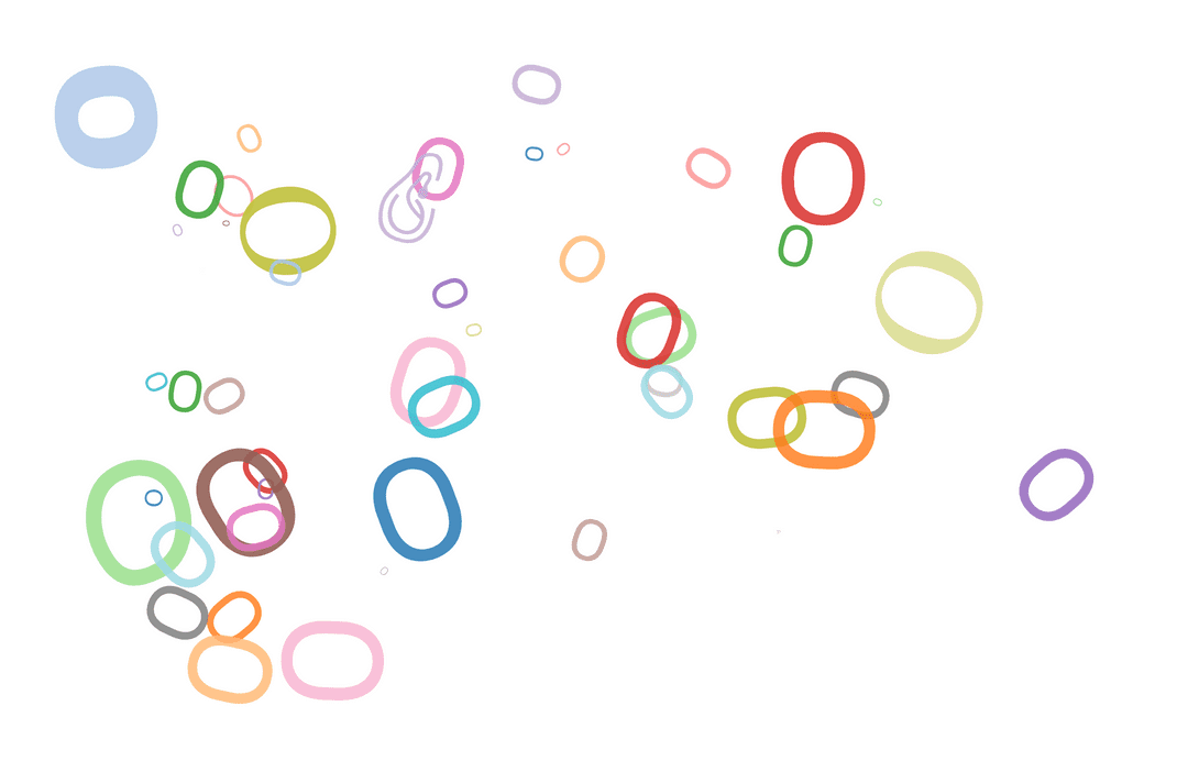
Another function of this is transforming each x, y, and angle positions of the font. I used this idea to play around with different types of movement. I focused on just creating different possibilities for the letter "o".
